.svg)

Adding Colors to Missing Data in QuickSight | West Loop Strategy
Blog - Showing Data That’s Not There: QuickSight Part 2 - Adding Colors
In the first part of this mini blog series, “Showing Data That’s Not There: QuickSight” we learned how to visually display data that’s not there. In Part 2, we will walk you through how to show groups on our graph with colors!
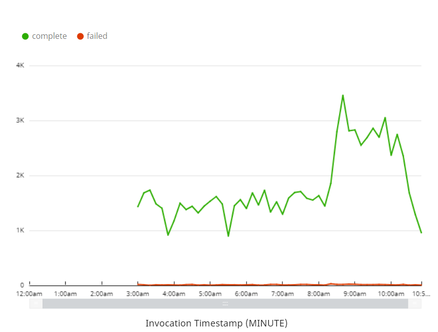
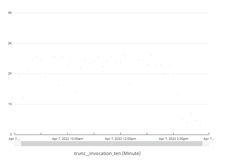
When we begin adding colored groups to our graph, our methodology changes a bit. If I add a color to the group, even with our new x-axis calculated field this is what will show:
We can see that it looks like our previous graph! But we are using the new calculated field! Hmm.
If we go into our settings of the graph and look at what is going on with the x-axis you will see why this is happening.
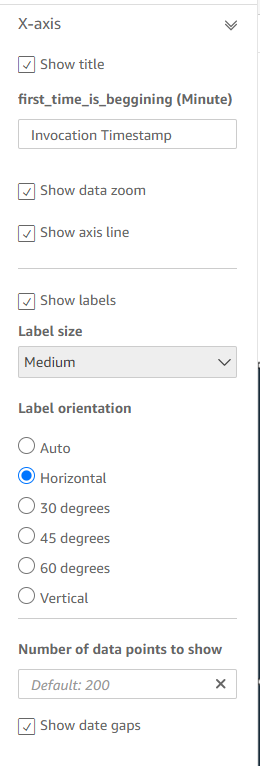
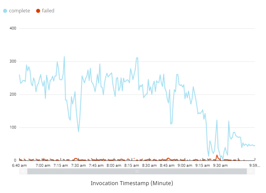
We can see that the “Number of data points to show” is defaulted to 200. If we take the color out it will go 2500 and the graph will look like how we want it again.
Ultimately, because our timestamp is based on the minute, QuickSight is only displaying 200 minutes, which is around 3 and a half hours (as we can see in our first graph).
How do we get around this? Unfortunately, 200 is a limitation in QuickSight - we can’t do more than that. But we can group the data to capture the minimum amount of time difference in groupings to display on a graph.
I am going to group the timestamps down to the ten minute mark. There are 1440 minutes in a day so the max amount of timestamp fields grouped to the 10 minute mark will be 144, which is well under the 200 limit in QuickSight.
I’m going to group the data down in SQL. We are using Amazon Athena to do this so I am going to add a field in Athena.
Here is how that field looks:
date_add(('minute',- mod(EXTRACT(minute FROM invocationTimestamp), 10), date_trunc('minute',invocationTimestamp)) trunc__invocation_ten,
Now I have a field in QuickSight with a timestamp grouped to the 10 minute mark. Let's put that into our graph now.
That doesn’t look so good... Let’s make it look a little better.
Go to settings and uncheck show data gaps.
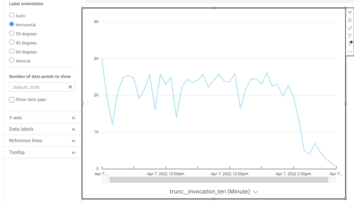
Now that looks better... But it’s how it was before! That’s because I need to make the new time field how I had the previous time field. I will show you the calculated field again here, but with the time field and a couple of special characteristics:
ifelse(timestamp_field={min_time},truncDate('DD',now()),timestamp_field={max_time},now(),timestamp_group_ten_field)
Note: I use our original timestamp_field for the min and max time checks. There will be much less data for one timestamp than any that are grouped down by 10. This will help with the visualization of the graph.
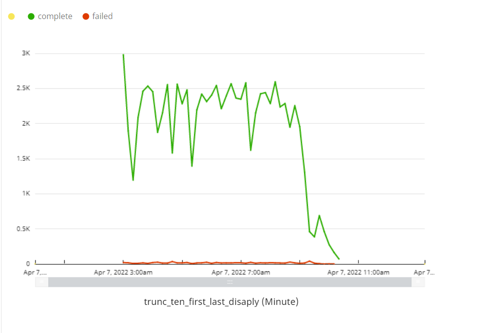
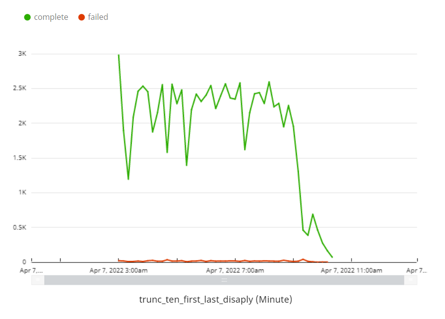
Ok let’s see how that looks with our color group.

As we can see, the completions don’t look the best like before. But we need to show the date gaps or else it will look just like individual dots as we also saw before. You should also notice that the failures are looking exactly how we want them to look. Hmm… Can we use that to our advantage?
What if along with the x-axis we also applied the same logic for the y-axis? Or the group?
I’m going to call our grouping field category_field. Let’s make another calculated field for this group:
ifelse(timestamp_field={min_time},'other',timestamp_field={max_time},’other',category_field)
Now let’s implement that to our color group in the graph.

Hey! It works. But that other field doesn’t look the best right? With some trickery, we can hide it:
First, instead of calling the value ‘other’ , let's change it to say ‘ ‘
ifelse(timestamp_field={min_time},' ',timestamp_field={max_time},' ',category_field)
When we do that here is how it looks.
Finally let’s hide that yellow dot. We can do that by making it white.

After making it white here is how it looks!
And there you have it!
Thank you all for continuing through this mini series - we hope it will help you with your dashboards.
Again, If you don’t want to do all of this yourself for your projects, feel free to reach out to us about consulting. We would be happy to help you with all things QuickSight!