.svg)

Missing Data in QuickSight Visuals | West Loop Strategy
.png)
Showing Data That’s Not There: QuickSight
Getting x-axis to show whole day when we don’t have data all day
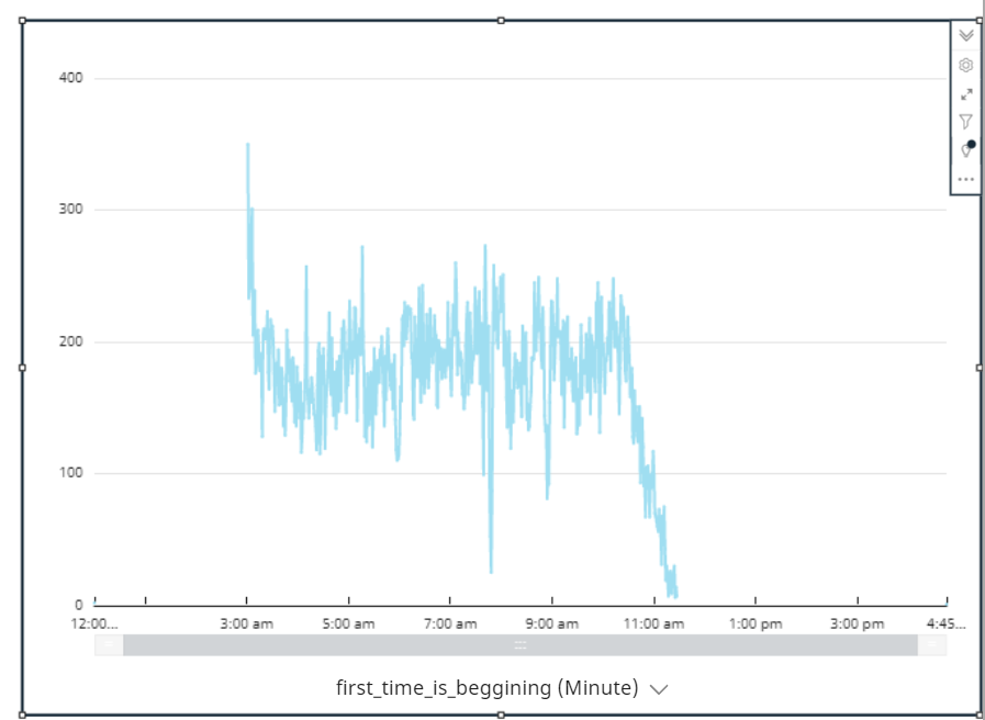
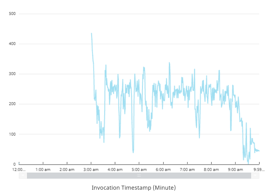
QuickSight is an amazing BI platform. It allows you to display your data in an extremely friendly and easy way. One thing however, is that when we look at data, QuickSight doesn’t display data that’s not there. That makes sense right? If I don’t have a particular category in my data I shouldn’t see that. However, what if we want to display data that isn’t there. Like the graph above. What can we do? Well I’ll show you a clever way to get your data to display exactly how you like it.
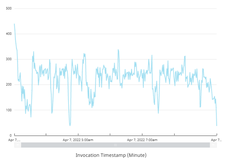
In the graph above, we are looking at api calls over a day. Now as you can see, we start the api calls around 3am and it ends at around 11am. That’s great! But what does QuickSight show me if I haven’t done anything to the data. As you can see below this is what you will see. I added my timestamp field into the graph and this is what QuickSight shows me. It shows me all of my data for the times that this invocation was populating. This makes sense, but it’s not what we want. So how do we tell QuickSight when to start and when to stop on our graph.
I will show you exactly how to do this with a calculated field. We do this with a calculated field in QuickSight so that it will automatically update based on your filters or parameters applied. To start we need a couple of fields.
Fields Needed:
- timestamp_field (of your field)
- max_time (of your timestamp_field)
- min_time (of your timestamp_field)
Note: We are doing this all based on a graph of looking at just today. You can change it to weekly, or whatever you want, but you will need to make those little changes. This will give you the template to create what you want.
Ok let’s get started.
We are going to create a calculated field of the timestamp field. This we will display on our x-axis. We will do this because this is how QuickSight will know what to show on the x-axis.
Calculated Field:
ifelse(timestamp_field={min_time},truncDate('DD',now()),timestamp_field={max_time},now(),timestamp_field)
Explanation: Takes the minimum timestamp and makes it 12am. That’s what the truncDate function does. Also, it takes the maximum timestamp and makes it now. Else it will display your timestamp_field.
Comments: This doesn’t reflect the exact graph. For instance 12am has a count of 2 when it shouldn’t have any count. Similarly now has a count of 1 when it shouldn’t have any. This is strictly for visual purposes.
Let’s now add it to our visual instead of the old timestamp.
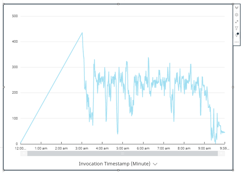
That’s getting closer but not exactly what we want. We don’t have a steady incline of requests over time. Let’s get rid of that.
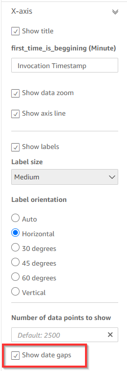
Go to the settings of the graph and click on the x-axis setting. Then click on the box that says show date gaps.
Now our graph will look like how we always wanted it.
Try it yourself and let us know if this is working for you! This article should give you the tools to be able to see how you can customize QuickSight to your personal objectives.
If you don’t want to do all of this yourself for your projects, feel free to reach out to us about consulting. We would be happy to help you with all things QuickSight!


